🌸Describing Scents For Writers 🌸| List Of Scents
🌸Describing Scents For Writers 🌸| List of Scents
Describing aromas can add a whole new layer to your storytelling, immersing your readers in the atmosphere of your scenes. Here's a categorized list of different words to help you describe scents in your writing.
🌿 Fresh & Clean Scents
Crisp
Clean
Pure
Refreshing
Invigorating
Bright
Zesty
Airy
Dewy
Herbal
Minty
Oceanic
Morning breeze
Green grass
Rain-kissed
🌼 Floral Scents
Fragrant
Sweet
Floral
Delicate
Perfumed
Lush
Blooming
Petaled
Jasmine
Rose-scented
Lavender
Hibiscus
Gardenia
Lilac
Wildflower
🍏 Fruity Scents
Juicy
Tangy
Sweet
Citrusy
Tropical
Ripe
Pungent
Tart
Berry-like
Melon-scented
Apple-blossom
Peachy
Grape-like
Banana-esque
Citrus burst
🍂 Earthy & Woody Scents
Musky
Earthy
Woody
Grounded
Rich
Smoky
Resinous
Pine-scented
Oak-like
Cedarwood
Amber
Mossy
Soil-rich
Sandalwood
Forest floor
☕ Spicy & Warm Scents
Spiced
Warm
Cozy
Inviting
Cinnamon-like
Clove-scented
Nutmeg
Ginger
Cardamom
Coffee-infused
Chocolatey
Vanilla-sweet
Toasted
Roasted
Hearth-like
🏭 Industrial & Chemical Scents
Metallic
Oily
Chemical
Synthetic
Acrid
Pungent
Foul
Musty
Smoky
Rubber-like
Diesel-scented
Gasoline
Paint-thinner
Industrial
Sharp
🍃 Natural & Herbal Scents
Herbal
Aromatic
Earthy
Leafy
Grass-like
Sage-scented
Basil-like
Thyme-infused
Rosemary
Chamomile
Green tea
Wild mint
Eucalyptus
Cinnamon-bark
Clary sage
🎉 Unique & Uncommon Scents
Antique
Nostalgic
Ethereal
Enigmatic
Exotic
Haunted
Mysterious
Eerie
Poignant
Dreamlike
Surreal
Enveloping
Mesmerizing
Captivating
Transcendent
I hope this list can help you with your writing. 🌷✨
Feel free to share your favorite scent descriptions in the replies below! What scents do you love to incorporate into your stories?
Happy Writing! - Rin T.
More Posts from Basket-of-references and Others
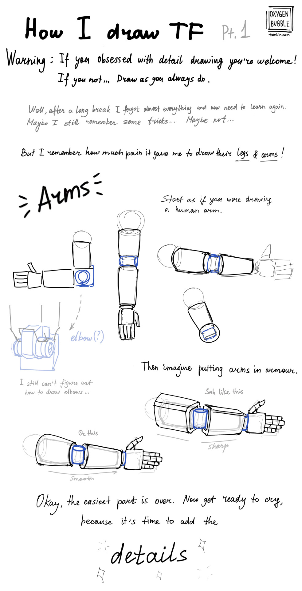

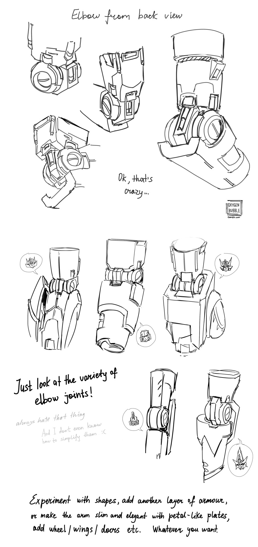

This is just a reference of what the most complicated parts of the TF look like.
There is not and will not be a step-by-step drawing here, because you have to figure out for yourself how this or that part of the robot works just by looking at the drawing.
If you found this post helpful, well, good for you)
I think the most heartbreaking thing is…writing does take practice. You’re probably not going to be at your best when you start out. The worst part about writing is that you’re going to be very shaky and probably pretty bad before you can get pretty good. Writing, like all forms of art, takes practice and discipline and willingness to try and keep going, no matter how difficult it may seem. And it can suck! We all know that! Creative ruts and writers block are tough but inevitable aspects of the process of writing. But just know that if you’re not satisfied with your work now, it only means that you’re going to be even better in the future. One day you’ll be able to look back at your work and go, “wow this kinda sucks, but that just means that I’ve gotten better now!” Writing takes time. You’re not gonna get good overnight. So keep going! Keep pushing! You only get better from here :)
Digital Painting: tips for beginners
Heyo! I got asked if I could make a tutorial on digital painting so I’m gonna throw together some advice meant for people who are starting out and want to figure out exactly how this stuff all works. Because it’s hard! What I hope to accomplish here is to make painting more approachable for you.
Firstly, I have put together something like this before, so for archival purposes here it is: http://holy-quinity.tumblr.com/post/89594801811/i-dont-know-how-much-of-this-kind-of-thing-you
For those of you who don’t wanna bother reading that, here are the main points:
1. Learn your program and its tools, from brush properties to layer styles. And I mean learn them. Make a cheatsheet that shows you exactly what each button and scale does, both in isolation and in conjunction with other buttons and scales. Refer to this as much as possible until it is intuitive. The end goal is to know exactly what to do to your brush’s settings to achieve a given effect.
2. It’s perfectly okay to use your sketches, linearts, and other forms of line in your paintings. They can help guide the form and there’s no need to make something fully “lineless”! I never make things “lineless.”
3. Study other people’s art and try to think how they could have possibly achieved the effects they did. You can learn a lot just by observing and mentally recreating the process stroke by stroke—muscle memory is a powerful tool at your disposal. This becomes easier to do once you’ve started doing item 1 above.
OKAY!
So where the heck do you even begin?
What I’m gonna do is try to make digital painting as approachable as possible for someone who’s never really done it. The main idea here is that digital painting is just like real painting. So if you’ve ever done real painting, you already kinda know what’s coming.
I’m gonna assume you know the basics of digital art: you can sketch, line those sketches using layers and opacity changes, and fill the lines with color, maybe even opting to add some shading…and you’ll get something like this:

You know, cell-shaded, or maybe the shading’s blended, but you’ve still obviously a line drawing with color put down on layers beneath the lines.
The next intuitive step is to try going “lineless”…but when you remove the lines you get this:

idk about you but I’m laughing at how stupid this looks
When I was first teaching myself to paint digitally, I didn’t really know how to deal with this. Without lines, the form of the subject vanished or became a mess like the above. Even if I was meticulous and careful about placing down the color such that without the lines layer turned on, the shapes fit together, it didn’t look quite right. There’d be gaps, I wouldn’t know how to incorporate the subject into a background, the contrast wouldn’t be high enough, or it’d just in general look too much like a screenshot from Super Mario 64.
Painting requires a different process than the above. You’ll have to let go of some of your habits and conventions. Such as staying in the lines. Such as fully relying on the lines. Like, I love my lines, I love my sketches—but in painting, they are guides for form, and are not the form itself. So let me go through how I approach a given painting:

My painting process starts with a sketch (here a boring portrait for demonstrative purposes). I make the opacity of the sketch layer something like 30%, and then throw down my base colors on a new layer underneath. I’m not being meticulous about the sketch itself, because again it’s just meant to guide my placement of color. I’m also not meticulous about my placement of the color.
We’re essentially sketching with color. Because ultimately what we want is for the color to take on the form and shapes conveyed by the sketch.
There’s a lot going into this about how to use value, how to shade, how to use color, etc. that I’m kinda skipping over because it takes a lot of time to explain…but there are hundreds of tutorials out there on those topics so please, google around! I found some helpful tuts that way when I was starting out.
Something I find v useful is to keep selecting colors that already exist in your image for shading and hue adjustment. This is why I start with really blendy, low-opacity brushes when throwing down color on top of the background. I can then select colors within there that are a mix of the two.
For instance, I’ll select the color of the lines here:

…and use that to shade:

And maybe I’ll select one of the darker shades around his eye, but not the darkest, to make the shading a smoother gradient…and so on.
What I do in general at this point is go over the shapes and lines of the sketch. Such that I can turn off the sketch layer and see this:

I’m replacing the lines with shading and value. I’ll continue to do this as I keep adding color.

This is all super loose. I am not dedicated to any particular stroke. I just want the colors and shading and light source to be right. I’ll use overlay layers to boost contrast or add a hue.
Here are other examples where I used this process:


I am constantly changing brushes and brush settings as I paint. It really depends on what effect I want where. I am also constantly selecting new colors and applying or blending those in. I don’t believe in having some uniformly applied base color and then shading with only one or two…that’s what I’d do if I was cell-shading like the first drawing I showed you here, but painting should be about messing with color and opacity and blending to make millions of hues!
Good rule of thumb: Hard, opaque brushes for applying color. Soft, dilute brushes for blending colors. Sometimes hard, dilute brushes can make some cool blending effects! I personally prefer harder edges on my shading so that’s a brush I use often.
This is getting a bit long so I’m gonna split it up into multiple parts, but really what I want you to get from this is:
1. learn the tools at your disposal until they are intuitive
2. sketch and line are guides for form, not the form itself
3. rather, hue and value will produce the form
And of course, practice makes perfect!!! Every drawing you make, every painting you make, will bring you one step closer to the artist you want to be, and thus every drawing and every painting, no matter what, is a success.


I don’t know if I even did this right it seems too complicated lmao
Anyways a couple of of you guys have asked me for help on drawing robot bodies cause your confused on mechs a femmes I guess I’ll call them. I used Transformers Prime robots cause they’re not too blocky but not too human looking either. This isn’t a tutorial on how to detail them just how to draw the basic shapes. I hope this at least helps a little bit. sorry for my awful handwriting lol. my text thing doesn’t work on my photoshop
I feel stupid for asking this so im using anon, but how do you draw the hijab? Whenever I try it looks like an egg www
also, Ramadan Mubarak! May Allah bless you
Don’t feel stupid for asking! Drawing is hard no matter what you’re drawing, so don’t be afraid to ask for help^^ But honestly even I feel like the best of my hijabis look a little egg-like, and that’s okay!


This tutorial is already taking so goddamn long, so I’m just gonna link my coloring and shading tutorial I did a month ago 😭😭

Gosh, I hope what I wrote made sense 😅 But thank you so much for the well wishes! Happy Ramadan (Eid Mubarak at this point WAHHH), and the same to you, may you and your loved ones have many blessings!!
ADDITIONAL REFERENCES
Winchester Meg's Hijab Drawing Tutorial
Souratgar's Hijab Drawing Tutorial
General Tips for Drawing and Shading Fabrics

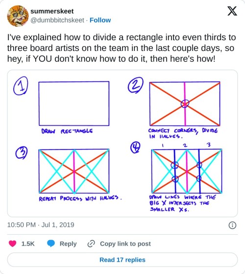
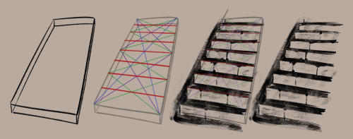
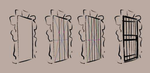
really helpful technique ^ once you know how to divide by halves and thirds it makes drawing evenly spaced things in perspective waaay easier:


These brushes aren’t the most complex, but they are what I made on the fly to make drawing hair easier, instead of hand drawing every detail like I’ve done most of my life lmao.
You can find the png files for a bitmap here, along with screenshots of my settings [I use this brush in Medibang Paint Pro, a free art program]. My settings use it as a scatter watercolour, I think it works well with the watercolor for color blending but you could theoretically use it just as a scatter.
Though, the brush settings are something not that important: the size, particle size, scatter strength, opacity, compliment, and color mixing are all things I change frequently when working.
Free to use, just don’t claim as your own. If you want to support me, you can leave a tip at my Kofi.


following my meme post the other day, and talking to friends further on the subject of fat characters in art, especially in fandom, i figured some people might like a tutorial on how to draw them.


I made a mini tutorial on how I approach Those Face Angles in my art, for free!
I've got a few more mini tutorials on my patreon if you'd like to support me too :D Patreon Link!
-
 maincharacterexe liked this · 4 days ago
 -
 crescentataraxy liked this · 5 days ago
 -
 choiscupid liked this · 5 days ago
 -
 minortehe liked this · 5 days ago
 -
 helaenarose liked this · 5 days ago
 -
 ov-rwhelmed liked this · 6 days ago
 -
 theelusivemidnighthoe liked this · 1 week ago
 -
 skylarubyy liked this · 1 week ago
 -
 pixie-in-trebleland reblogged this · 1 week ago
 -
pixie-in-trebleland liked this · 1 week ago
-
 aurevoirjulia liked this · 1 week ago
 -
 goripanda reblogged this · 1 week ago
 -
 krownest liked this · 1 week ago
 -
 multicoloredpandaface reblogged this · 1 week ago
 -
multicoloredpandaface liked this · 1 week ago
-
 murderkitten666 reblogged this · 1 week ago
 -
murderkitten666 liked this · 1 week ago
-
 enjaami liked this · 1 week ago
 -
 touchmycoat reblogged this · 1 week ago
 -
touchmycoat liked this · 1 week ago
-
 ruthlesslistener liked this · 1 week ago
 -
 sunnylittledragon reblogged this · 1 week ago
 -
sunnylittledragon liked this · 1 week ago
-
 zixinyu liked this · 1 week ago
 -
 willcraftapple11 reblogged this · 1 week ago
 -
 leviathiane reblogged this · 1 week ago
 -
 jackcritter liked this · 1 week ago
 -
 fleetn-crab85 liked this · 1 week ago
 -
 idkaguyorsomething reblogged this · 1 week ago
 -
idkaguyorsomething liked this · 1 week ago
-
 fictions-by-andy reblogged this · 1 week ago
 -
 writingrefsasifiweregoingtowrite reblogged this · 1 week ago
 -
 seahortensia liked this · 1 week ago
 -
 rotundkat liked this · 1 week ago
 -
 simplytemonade liked this · 1 week ago
 -
 ikeberry liked this · 1 week ago
 -
 decembercamiecherries reblogged this · 1 week ago
 -
 miasarah liked this · 1 week ago
 -
 moonlightunknown liked this · 1 week ago
 -
 myheartismadeofstars liked this · 1 week ago
 -
 mistymountains2011 liked this · 1 week ago
 -
 offbeatwyrd reblogged this · 1 week ago
 -
offbeatwyrd liked this · 1 week ago
-
 thesweetestescapexoxo liked this · 1 week ago
 -
 petasos liked this · 1 week ago
 -
 stayuntilthefoglifts liked this · 1 week ago
 -
 endlcssdesiire liked this · 1 week ago
 -
 jenna12381 liked this · 1 week ago
 -
 lieferanth liked this · 1 week ago
 -
 starheavenly liked this · 1 week ago
