Explore the world, one post at a time
Coloring - Blog Posts
Here is some old (like 3 years old) naruto manga colorings from when I wasn’t as good at art👍 Hinata was my first one tho so I think I did rlly at the time- might do one promoting my sakukarin ship propaganda since I haven’t completed a manga coloring in like a year…


Coloring tsunades jacket without having to redraw it made me almost cry:( I also had a hard time finding good quality kushina manga pics so I had to choose one I didn’t rlly like. You can tell I rushed it since I didn’t like it- might post past coloring wips that won’t ever get done.

"I'm still all sweaty" - Chie
(finished coloring yay)


Manga coloring #9


This manga is so good 😭🙏, I'm so glad it's getting an anime 😝😝
My lil silly 🤫🤫

I want my art to get attention like my manga coloring does 😭🙏🙏
Old art comparison 💀🙏


LAWDDDD, WHO LET ME POST THAT, thank god I learned shading 😭🙏
Manga coloring #8


This time it's not actually a manga panel but I wanted to color it 🙏🙏 (artist in bottom left)
Manga coloring #7


This one was actually so difficult, I even lost my pen halfway through 😭😭🙏🙏
Lil doodle 🤭🤭

Something a lil bit different but I just felt like posting it 🙏🙏
Manga coloring #6


Kaneki is so babygirl 🤭🤭🤭
Jjk manga coloring #5


Gege should give my boy his moment 🙏🙏
Jjk manga coloring #4 (MAJOR SPOILER ‼️‼️)


This is my way of coping guys.... I SWEAR HE'LL COME BACK 😭😭🙏🙏🙏
JJK manga coloring #3


Ngl toji was kinda peak in s2... (Im a gojo lover 😋)
JJK manga coloring #2 🤭


I'm actually super proud of this one 💀
JJK manga coloring 😋😋


Ignore the fact that I take the longest breaks know to man 😊
IM SO PROUD OF MYSELF 💪 (I didn't make the bg, the bg was taken from Ibis paint)


Here's a spoiler of what I'm coloring, it's taken me 3 days to color it and I'm not even done 😀

Colored a picture with my bestie 🤩 (art is by Sad-ist)


“Here’s the story of how I became Dabi…”
Chapter 349


The problem with starting an intensive writing project and an intensive coloring project is both needing huge amounts of time and the ability to lock in, but me being indecisive and then working on neither.
Pls go like my Tiktok my account is barren and I worked hard on this
https://www.tiktok.com/t/ZTF6gsPSn/


i dont really need a whole tutorial but i was wondering if you had any coloring tips?
uhm uhm i guess the main thing for me personally is for shading, don’t use a colour that’s just darker than your base colours e.g if you have yellow, don’t use a darker version of that same yellow. use an orange or pink

using a darker version of base colours is boring imo. play around with colours until you find something you like. mix colours together. its fun
i hhope that helped
Hi! I really love your art and I'm wondering if you should show me how you color and shade. thanks! :)

tadaaaaa!
HIIRAREFS: Basic and Intermidiate guide to colouring in
What better day to end the year then with a basic guide to colouring- This is for beginners or intermediate artists. Colouring is a big part to an art piece, whether you decide to use colours or not, that’s up to you, but for the most part, having some knowledge on appliance of colour will really help you out!
____________________________________________
ARTISTS WITH AN INSPIRING KNOWLEDGE OF COLOUR APPLICATION! Please take the time to have a look at other artists work so that you ca research and get inspired!
Gullacass: Uses brights, dulls and pastels to create brilliant guro, pop and macabre pieces| DA + TUMBLR
TinyCalcium: Old friend of mine who explores brights and mustard colours and places them as a foundation for their work | TUMBLR
BeastPop: Talented with opposing and Triwheel colours. Outstanding cell-shading, and knows how to flexibly bend colour form to their will in popart. | DA
H0stel: Fantastic composition of light direction and applies colour to bodies based on ambient occlusion. | TUMBLR
_____________________________________________
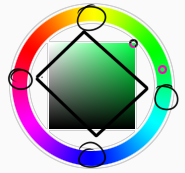
COLOUR SLANG: I use some strange slang to express colour types and shades as well as groups. Although they may not be canonically correct, I will use these terms to describe colour palates to the best of my ability! Analogous: Colours that are near or adjacent to each other on the colour wheel, EG: Red and Orange
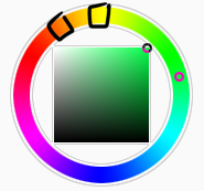
Oppositional/complimentary: Colours that are opposed or opposite from each other on the colour wheel, EG: Cherry and Green
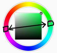
Triadic: Colours that form a triangle on the Colour wheel, EG: Cyan, Magenta and Yellow. These three colours when mixed together will make black.
Arrowtype/Quadcolour: Four colours, that generally form an arrow shape on the colour wheel.
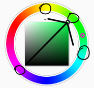
Tetradic: Colours that form a rectangle or square in the colour wheel
Neons: The very brightest you can get a colour, be careful where you use them as they can look ugly together at the most. Try to use neons when you are adding bright glowing objects to your piece. Neons are great for highlights.

Brights: Slightly washed Neons. Appropriate if you have characters that are colourful.

Washed: Very washed brights with a hint of grey. These are also useful for colourful characters.

Pastels: Colour with white in them to make them seem light.
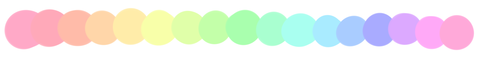
Baby Pastel: Pastel with even more white in them, good for subtle highlights.

Darks: Colour with black added to them. Used mostly for lineart.

Mustards: Colours with dark grey added to them

Earthen: Colours with brown added to them

Warm and Cool colours: Warm colours are colours that range fromMagenta to Yellow. Cool ones range from Lime to Fuchsia.

Straight tones: A greyscale palate. or a straight scale of one colour from black to it’s neon form.

Warm and cool tones: Warm tones are a greyscale mixed with warm colours and cool tones are greyscale mixed with cool colours.

Skintones: Warm washed or pastel colours generally used to colour in skin, but they don’t have to be warm at all! ( I will not show you a palate for this however)
______________________________________________
WHAT TO AVOID WHEN COLOURING: beginner artists, tend to go ahead and start by colouring their line art with neon and mustard colours. Neons are not necessarily good for base colours unless the character has a glow.

I often see lazy attempts to shade, often a beginner artist with use an airbrush and use black and white to shade and highlight their piece. This is not very effective, and I’m sorry to say… It’s kind of gross as well. Try to avoid being lazy. If you have a piece that has bold black lines, avoid using soft shading and airbrushing at this point of time.

Black and white isn’t always the best option when colouring in your piece, but it also depends on the style you are trying to convey. If you plan on only using straight tones to colour in a piece, black and white is good.

A GOOD BASIC WAY TO COLOUR For this basic tutorial I will show you a nice way to colour in a piece with bold lines. I will be using Minty’s Classic character as an example.
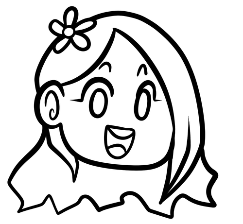
Begin with using brights that have been washed down a little and washed skin tones if your character is human based. Avoid using neons or mustards if you are able. If there is white on the character, such as the white on an eyeball or the teeth, consider using baby pastels. For Minty’s eyeballs I have used a baby pastel blue. I have chosen to use a darker and more washed version for her Irises.

With you foundation colours placed down, use a washed warm colour for the skin tone, such as a salmon. If the character’s hair or fur is warm coloured, use a pink or red orange to shade that as well. Use the cell shading technique. This may mean you will have to erase some of your shading so be sure to do this on another layer. For your baby pastels, you can use a regular pastel to shade it. For Minty’s eyes I have used pastel blue and lowered the opacity by a little.

For Highlights, I have chosen to use baby pastel yellow. I wanted the piece to be warm.

Applying a light airbrush over the top of the piece makes it feel a little softer. I have also applied the airbrush over the initial borders to create colour bleed, giving a very subtle reflective approach.

Colouring your line art layer, particularly if you have bold lines, can really make a piece look more interesting! I like to leave the overall outline black. You can gradient and bleed colour in your line art as well

Light tracing is a technique lots of artist’s use, where they run a sharp line of highlight next to line art to divide borders.

This looks a lot nicer than the black and white shading, doesn’t it!? __________________________________________
This is a very very simple guide to applying colour to your piece! If This helped, please reblog and share this guide around!
If you have any questions or feedback, don’t be afraid to send me a message!